Why color needs a system
Most brands start with one or two colors picked for a logo. Then the website needs a button color, the printer asks for CMYK values, the sign maker wants a paint match, and someone picks a gray for body text that turns out too light to read. A few years later the same brand shows up in five slightly different blues.
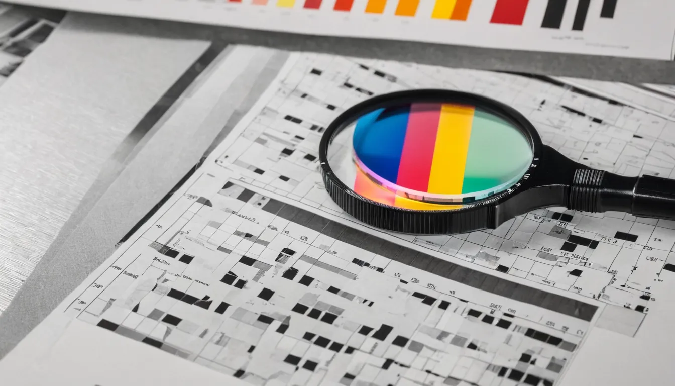
A color system fixes that. It names a small set of colors, gives each one exact values for screens, print and paint, and sets rules for which colors can sit together. The panel above shows one part of that work: every color pair checked for readable contrast.
Services
Brand color palettes
Primary and supporting colors, neutrals and rules for using them.
Accessible color
Text, button and chart colors checked against WCAG contrast levels.
Print and screen matching
HEX, RGB, CMYK and spot values that read as one brand.
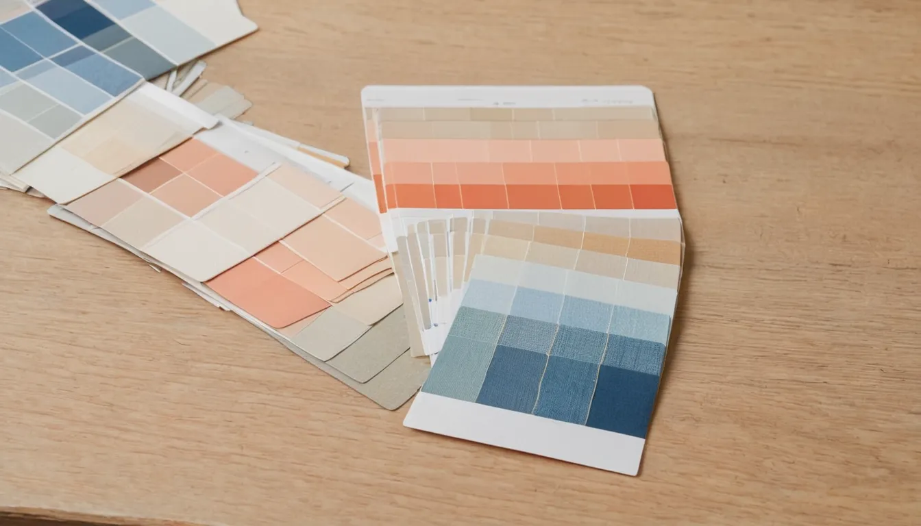
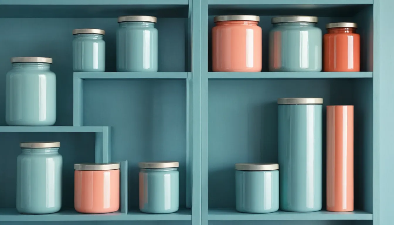
What finished palettes on real materials look like
What to send
- Your current logo files and the colors you use now, with any codes you have (HEX, RGB, CMYK or spot)
- Where the colors must work: website, app, print, signs, packaging, vehicles
- Your printer or sign maker, if you have one
- Competitors or brands whose colors you want to stay away from
- Any accessibility requirement you have to meet, such as WCAG 2.1 AA
- Your deadline, and whether a rebrand or a launch depends on it
If you don't have codes for your current colors, send a photo of something printed and the logo file. We can work from those.
Where we work
All work is remote, so location matters only for call times and for printers you may want to use. These pages cover businesses in three cities.
Philadelphia, PA
Brand color work for Philadelphia businesses and organizations.
San Francisco, CA
Brand color work for San Francisco businesses and organizations.
Sacramento, CA
Brand color work for Sacramento businesses and organizations.
Common questions
How much does a color palette cost?
It depends on how many colors and surfaces are involved, whether print and spot color matching are needed, and how many revision rounds you want. We quote each project in writing after reading your brief.
Do you redesign logos?
No. We work on the colors around your logo and can suggest color changes for it, but the logo's shapes stay as they are.
Will my colors look the same everywhere?
Close, not identical. Screens, paper types and paint all show color differently. We pick values that look like the same color on each and check them on printed proofs.
Are the palettes on this site real brands?
No. The palettes are concepts made for this site, and the photos are AI-generated samples. Both are labeled. We don't show client brands without permission.
Colors not working together? Send what you use now and where it has to work: screens, print, signs or packaging.
Request a quote